
5 Mobile Ecommerce Optimizations for the 2018 Holiday Shopping Season
With less than two weeks before the 2018 holiday shopping season is in full swing, there’s no time like the present to check off a few last minute mobile shopping cart optimizations. Need a little convincing? Consider this. According to eMarketer, holiday mobile ecommerce spending is expected to jump 32.6% in 2018 and will account for 44% of all holiday ecommerce spending.
Not only is mobile ecommerce spend increasing, shoppers are demanding a better mobile shopping experience and rewarding the businesses who can provide just that. Here are five quick and dirty mobile ecommerce optimizations to help your business maximize online revenue during the 2018 holiday shopping season.
1) Optimize for the “thumb zone”
In the era of huge screens, a mobile site optimized for one-handed browsing is one component of a great visitor experience.
Here, let’s have Apple explain in a way only Apple can…
Visitors who can comfortably scroll, navigate, “click” and search with one hand are rewarding mobile site owners with more pages per session and longer site durations. Two metrics that correlate to higher online conversion rates.
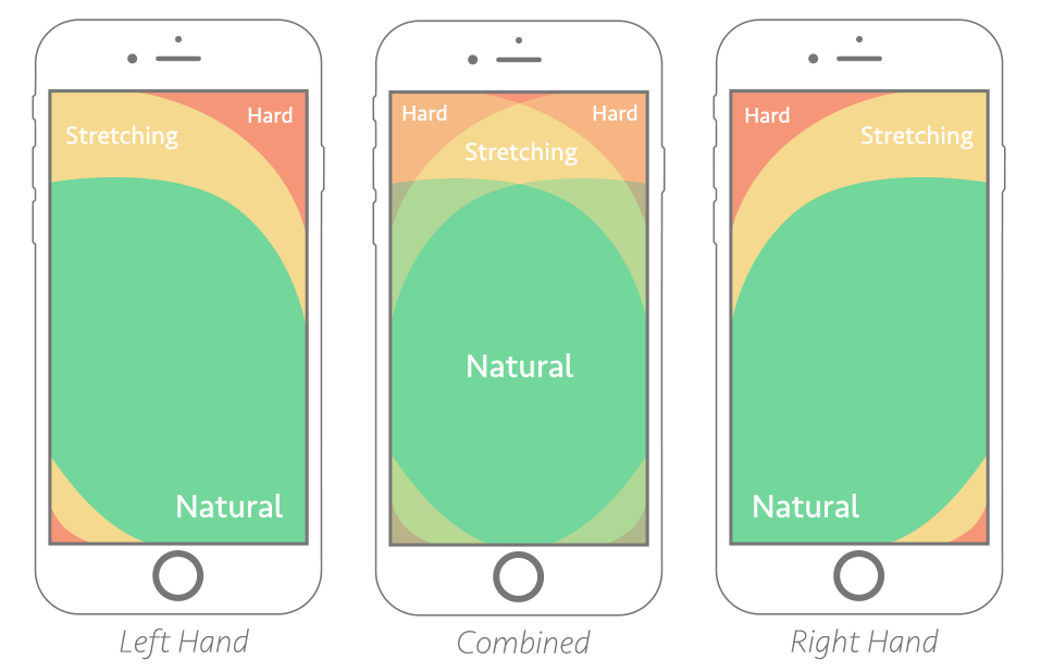
So, how do you optimize for the thumb zone? Focus on the middle-bottom when placing calls to action. It’s more reachable and more natural for mobile shoppers to look where their thumb is. Much like a cursor on a desktop.
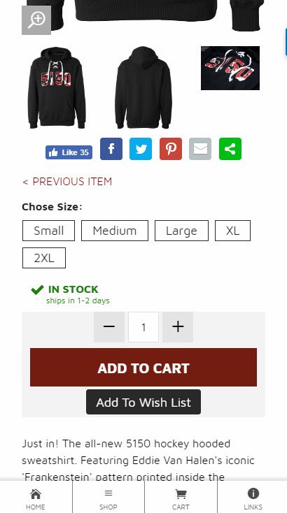
Ecommerce sites should also consider placing add-to-cart, quantity, sizing – any product variations – below the product images and descriptions on their product pages. Not above or next to as is common in a desktop environment.
2) Use a “fixed” navigation menu
Along the same lines as optimizing for the thumb zone, but still in the “test-before-implementation” bucket, is using a navigation menu fixed to the bottom of the mobile device viewport.
Again, this keeps all of your primary navigation elements directly in reach – cart, categories, search, etc. If you’re not willing to commit to a fixed bottom navigation, I highly recommend fixing the navigation to the top of the viewport which is much more common. Nothing is worse than a deep-scrolling mobile website that makes you scroll all the way back to the top to find the site navigation.
3) Add the free Facebook Messenger Chat tool
The buzz phrase to watch out for in 2019 will be “conversational commerce.” Which is a fancy way of saying businesses and shoppers connecting on-site through live chat. A Forrester report found that for customers who chat prior to making a purchase, there is a 10% increase in average order value and a 40% increase in conversion rate. That’s kind of a big deal…
With the customer adoption of live chat growing exponentially, there are literally hundreds of live chat options available for your website. Thankfully, the good guys over at Facebook offer the quickest and simplest implementation around. And it’s free.
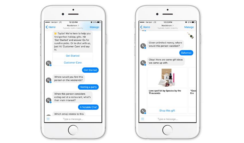
Within 10 minutes and a simple cut-and-paste implementation, your business can be offering live chat support to all potential shoppers. Even better, messages go straight to the inbox of your Facebook business page allowing for streamlined communication within a platform you’re probably already familiar with.
4) Enable shoppers to casually browse OR precisely search
There are two schools of thought to this one – try to get people into your sales funnel and checked out as soon as possible, OR keep people on your site and browsing for as long as possible.
To that I say… it depends.
If your ecommerce store specializes in urgency based conversions such as ticket sales or lead generation, speed is the clear winner. If your specialty lies in a more casual shopping journey such as clothing or home products, time on site and pages viewed become a key indicator of consumer interest and site performance.
Creating a site structure that allows shoppers to casually navigate between categories; view top rated products; use various sort and filter options; see related or recommended products; will keep them “sticky” and onsite for longer.
On the other hand, providing a great search function which includes features such as predictive autocomplete, error tolerance for typos and is easy to use on a mobile device can take impulse visitors from prospect to customer in minutes.
5) Speed thrills, friction kills (conversions)
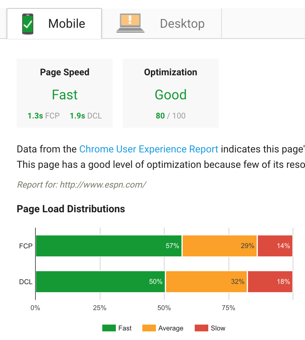
In our annual post-mortem of 2017 holiday online shopping statistics we found out that the average retail website was visually complete and ready to use within 2.75 seconds. But keep in mind, that’s only the benchmark.
Another way to look at it is if your retail website takes longer than 2,750 milliseconds to load, it’s performing below average and below what online shoppers have come to expect.
Yikes.
Thankfully, some great free tools exist to help businesses get to the bottom of their page load times such as Pingdom, GTMetrix and of course Google PageSpeed Insights. I recommend using all three as they tend to give mixed results.
Some of the lowest hanging fruit when it comes to quick pagespeed fixes include:
- Upgraded website hosting
- Implementing a website caching plugin or solution
- Decreasing image dimensions and compressing image file sizes
- Consolidating and minifying as much HTML, CSS and Javascript as possible
- Using a content delivery network (CDN)
The reason for the season
We can dangle the urgency of the 2018 holiday shopping season as the driving force behind these quick optimizations, but the truth is these changes will set your business up for long term success and keep customers coming back well into the new year. The holidays can be a stressful time, especially for retailers, but hopefully a little extra cash as a result of an increase in online conversion rate will make it all worth it.

