
Typographic Terminology: The Anatomy of Type – 01 The Basics
Welcome to the intro to typographic terminology. Whether you’re an in-house designer or working client side, having a shared vocabulary is invaluable when trying to express your vision. In this post, you’ll learn the basic anatomic makeup of your favorite characters.
Terms.
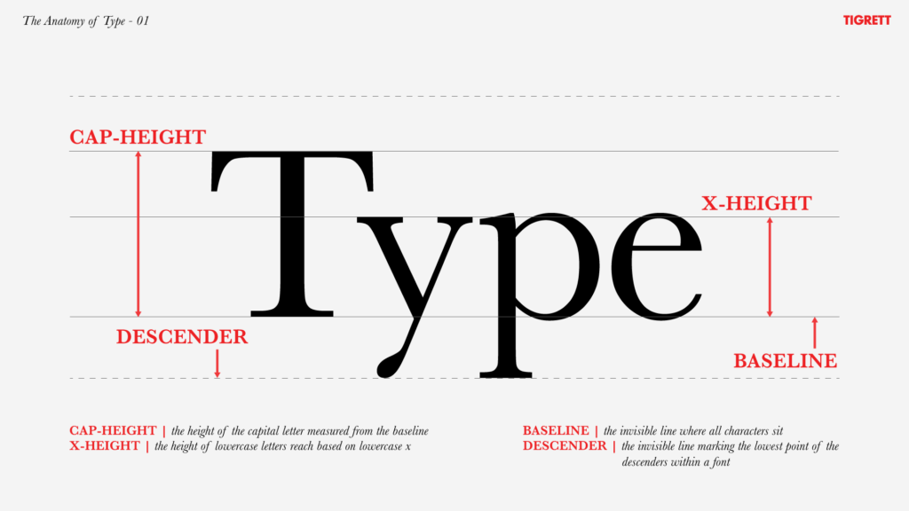
Cap-Height: This is the height of the capital letter measured from the baseline. This can be seen in the example above with the “capital T”.
X-Height: Intuitively named, this is the height of the lowercase letters within your font based on the height of the lowercase x.
Baseline: This is the invisible line where all characters sit.
Descender: Yet another invisible line, this one marking the lowest point of the descenders within a font. This can be seen with the lowercase p in the example above.
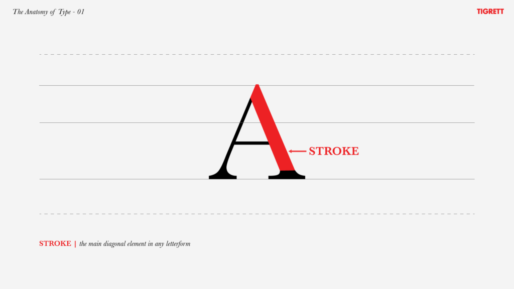
Stroke: The main diagonal element in any letterform, such as the diagonal in an A, N, W, or Y.
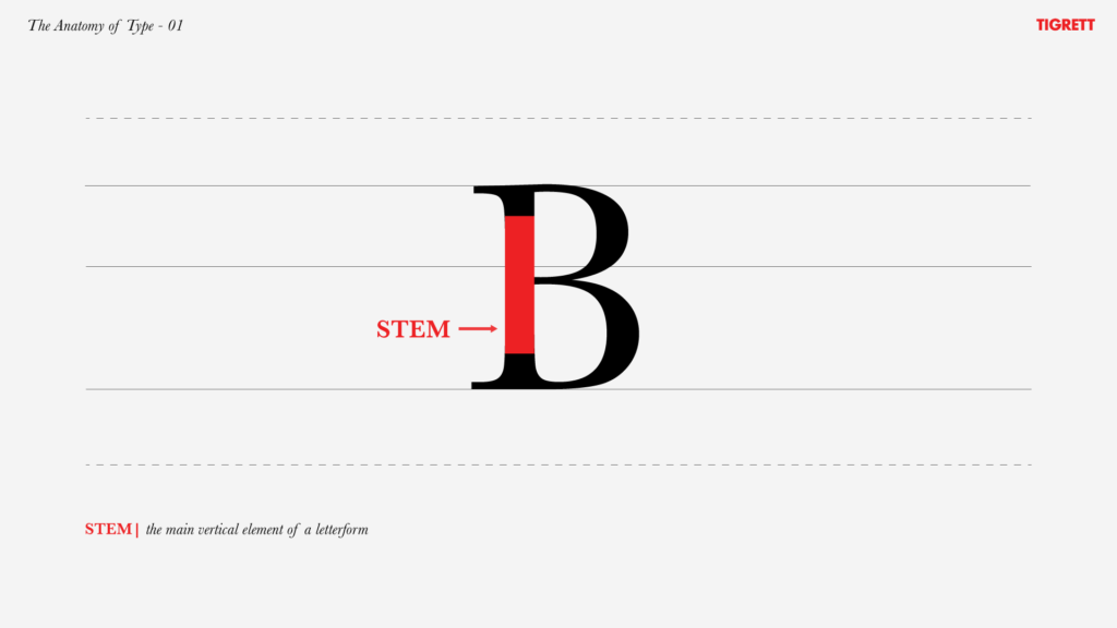
Stem: The main vertical element of a letterform.
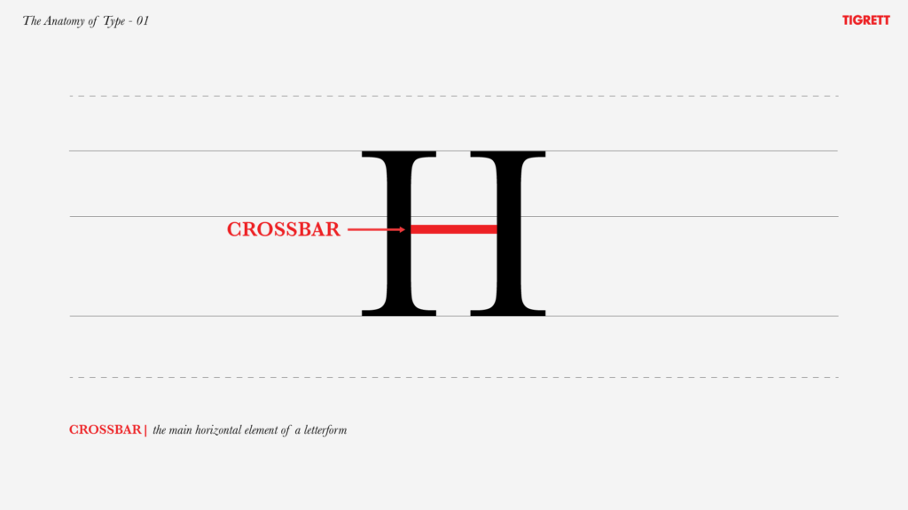
Crossbar: The main horizontal element of a letterform.
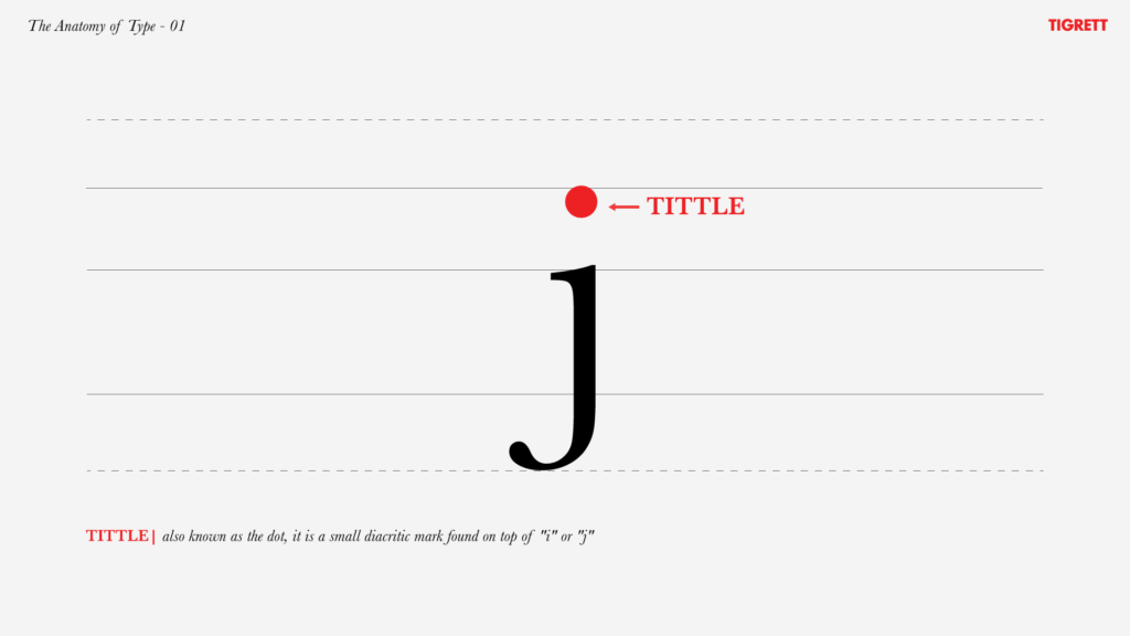
Tittle: Also known as the dot, it is a small diacritic mark found on top of “i” or “j”.
Now that you have a better understanding of the basic anatomy of type, go out and impress your designer friends!

